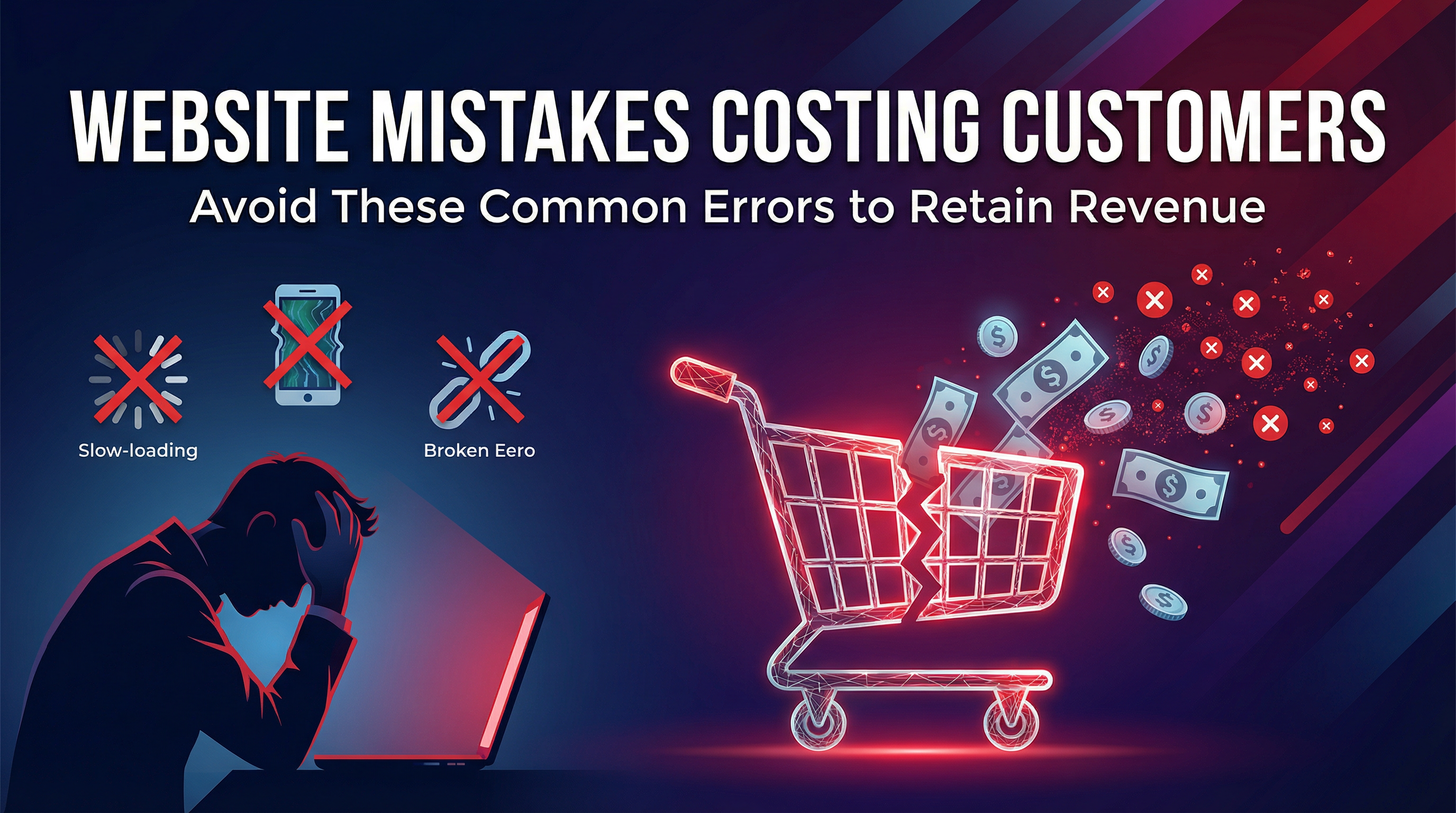
Your website might look fine to you. But small mistakes—invisible to you, obvious to visitors—can silently drive customers straight to your competitors.
Here are 15 website mistakes I see constantly, and how to fix each one.
1. No Clear Value Proposition Above the Fold
The Mistake: Visitors land on your homepage and can't immediately tell what you do and why they should care.
Why It Hurts: You have 3-5 seconds to capture attention. Confusion = click away.
The Fix: Your headline should clearly answer: "What do you do, for whom, and what makes you different?" No clever wordplay—just clarity.
2. Missing or Buried Contact Information
The Mistake: Phone number, email, and address are hidden in the footer or require clicking through multiple pages.
Why It Hurts: Customers ready to reach out give up if it's not easy.
The Fix: Contact info in the header. Phone number clickable on mobile. Contact page linked prominently. Consider a sticky contact button.
3. Slow Loading Speed
The Mistake: Large images, bloated code, cheap hosting—your site takes 5+ seconds to load.
Why It Hurts: 53% of mobile users abandon sites that take over 3 seconds. Google also ranks slow sites lower.
The Fix: Compress images, use caching, upgrade hosting, minimize plugins. Test with Google PageSpeed Insights—aim for 70+ on mobile.
4. Not Mobile-Friendly
The Mistake: The site works on desktop but is broken, tiny, or unusable on phones.
Why It Hurts: 60%+ of traffic is mobile. Google uses mobile-first indexing—your mobile experience IS your SEO.
The Fix: Responsive design that adapts to all screen sizes. Test on actual phones, not just browser tools.
5. Confusing Navigation
The Mistake: Too many menu items, unclear labels, important pages buried in dropdowns.
Why It Hurts: If visitors can't find what they need in seconds, they leave.
The Fix: Maximum 7 main menu items. Clear, descriptive labels. Most important pages accessible in one click.
6. No Clear Calls-to-Action
The Mistake: Pages end without telling visitors what to do next. No buttons, no direction.
Why It Hurts: People need guidance. Without a clear CTA, they bounce.
The Fix: Every page needs a purpose and a clear next step: "Get a Quote," "Call Now," "Learn More." Make buttons stand out.
7. Stock Photos That Scream "Stock Photo"
The Mistake: Generic handshake images, fake-smiling models, or obviously staged photos.
Why It Hurts: Customers can tell. It feels impersonal and untrustworthy.
The Fix: Use real photos of your team, work, and location. If using stock, choose natural, less posed options.
8. Walls of Text
The Mistake: Huge paragraphs of unbroken text. No formatting, no visual breaks.
Why It Hurts: People scan, they don't read. Walls of text get ignored.
The Fix: Short paragraphs (2-3 sentences). Use headers, bullet points, bold text for scanning. White space is your friend.
9. Missing Trust Signals
The Mistake: No testimonials, reviews, certifications, or social proof anywhere.
Why It Hurts: First-time visitors have no reason to trust you.
The Fix: Display customer reviews, testimonials with names/photos, logos of clients or certifications, Google reviews widget.
10. Outdated Design
The Mistake: The site screams 2010—dated colors, old design patterns, cluttered layouts.
Why It Hurts: Outdated sites make businesses look outdated. Customers question if you're still active.
The Fix: Modern, clean design with current typography, adequate white space, and contemporary color palettes. Redesign every 3-5 years.
11. No SSL Certificate (Not HTTPS)
The Mistake: Your URL shows "http://" and browsers warn it's "Not Secure."
Why It Hurts: Visitors see security warnings and leave immediately. Google ranks non-SSL sites lower.
The Fix: Install an SSL certificate (often free through your hosting). Your URL should start with "https://".
12. Broken Links and 404 Errors
The Mistake: Links lead to "Page Not Found" errors. Old pages were deleted without redirects.
Why It Hurts: Broken links frustrate users and hurt SEO.
The Fix: Regularly check for broken links. Set up 301 redirects for deleted pages. Have a helpful 404 page.
13. Auto-Playing Media
The Mistake: Videos or music start playing automatically when pages load.
Why It Hurts: It's jarring, often embarrassing (imagine opening a site in a meeting), and makes people close the tab immediately.
The Fix: Never auto-play audio. Videos can auto-play MUTED only, if necessary for design.
14. Forms That Ask Too Much
The Mistake: Contact forms with 15 fields asking for life stories before a simple inquiry.
Why It Hurts: Every extra field reduces form completion rates. People give up.
The Fix: Minimum fields necessary: name, email/phone, message. Ask for more information later in the sales process.
15. No Analytics Installed
The Mistake: You have no idea how many people visit, where they come from, or what they do on your site.
Why It Hurts: You can't improve what you don't measure. Flying blind wastes money.
The Fix: Install Google Analytics 4. Review monthly: traffic sources, popular pages, bounce rates, conversion rates.
Quick Audit: How Many Apply to Your Site?
Go through this list and honestly check:
- 1-3 issues: Minor fixes needed—you can probably handle these
- 4-7 issues: Significant improvements needed—consider professional help
- 8+ issues: Major overhaul required—probably time for a redesign
The ROI of Fixing These Mistakes
Let's say these issues cause you to lose 2 potential customers per month who would have paid $1,000 each.
That's $24,000 per year in lost revenue.
Fixing these problems typically costs $500-$5,000 depending on severity. The math is obvious.
Want me to audit your website for free? Get in touch and I'll review your site and tell you exactly what's costing you customers—no obligation.

