Pull your phone out and visit your website. Does it look good? Is it easy to use? Can you complete key actions without frustration?
If you hesitated on any of those questions, you have a problem—because over 60% of your visitors are on mobile devices.
The Mobile Reality in 2026
The Numbers
- 60%+ of global web traffic is mobile
- For local businesses, mobile traffic is often 70-80%
- 88% of users won't return after a bad mobile experience
- Google uses mobile-first indexing—your mobile site IS your site for SEO
What This Means for You
If your site doesn't work well on phones, you're actively pushing away the majority of your potential customers.
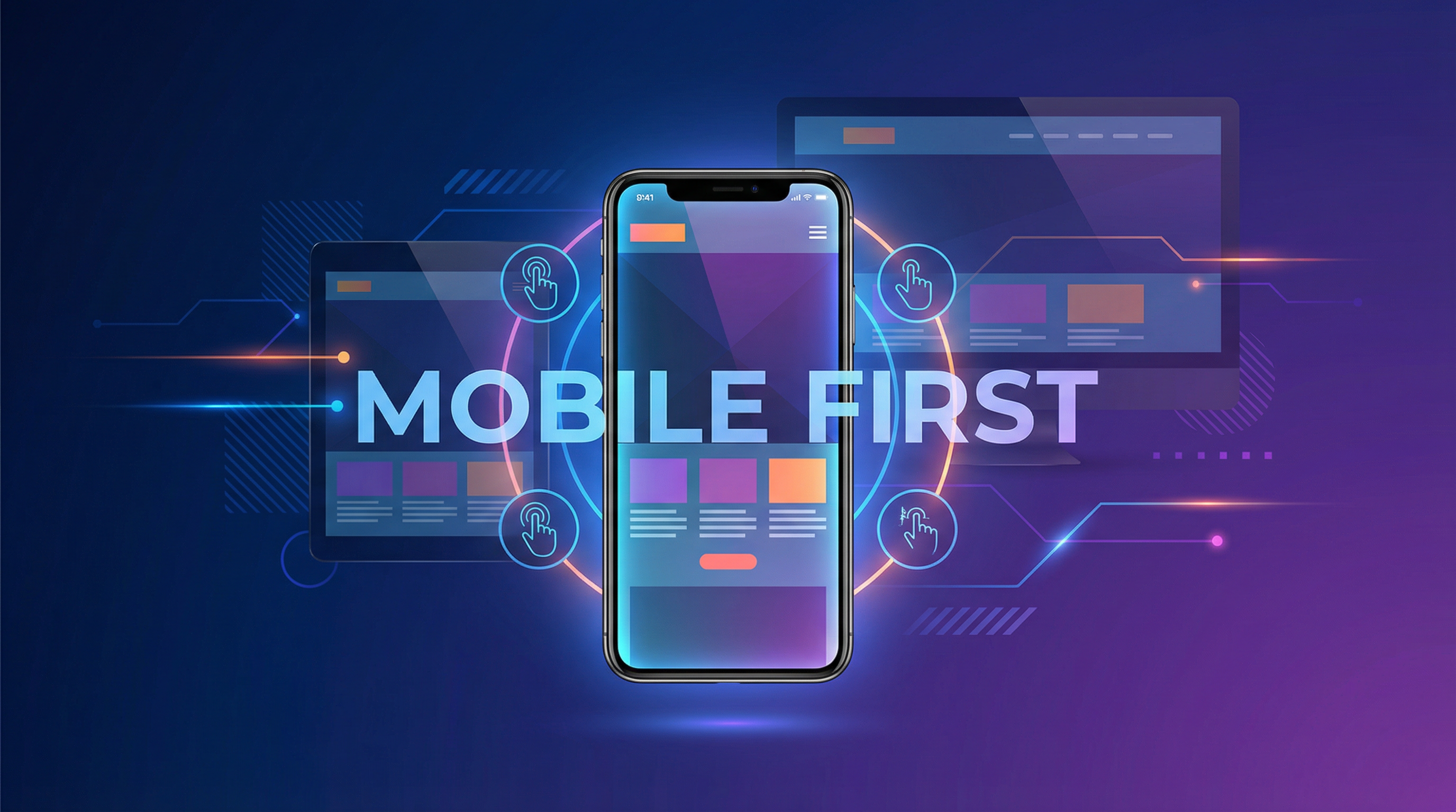
What is Mobile-First Design?
"Mobile-first" means designing the mobile experience first, then expanding to larger screens. This flips traditional "desktop-first" thinking.
Why Mobile-First Works
- Forces prioritization: Limited screen space means focusing on what matters
- Better performance: Starting small prevents bloat
- Matches user behavior: Design for how people actually browse
- SEO alignment: Google prioritizes mobile experience
Signs Your Mobile Experience is Failing
Technical Issues
- Text too small to read without zooming
- Buttons too small or too close together
- Horizontal scrolling required
- Images broken or loading slowly
- Forms difficult to fill out
- Pop-ups that are hard to close
User Experience Issues
- Important information buried or hidden
- Navigation confusing or cluttered
- Phone number not clickable
- Contact info hard to find
- Checkout process frustrating
Analytics Red Flags
- Mobile bounce rate much higher than desktop
- Mobile conversion rate far below desktop
- Short mobile session duration
- High mobile cart abandonment
Essential Mobile Design Elements
Navigation
- Hamburger menu (☰) for main navigation
- Sticky header with key actions accessible
- Clear visual hierarchy
- Bottom navigation for frequently-used actions
- Easy "back to top" functionality
Touch Targets
- Minimum 44x44 pixels for buttons and links
- Adequate spacing between clickable elements
- Easily tappable call-to-action buttons
Content
- Readable font size (minimum 16px)
- Adequate line height and spacing
- Short paragraphs
- Scannable with headers and bullets
- Images that resize appropriately
Performance
- Fast loading (under 3 seconds on 4G)
- Compressed, properly-sized images
- Minimal blocking resources
- Lazy loading for below-fold content
Forms
- Minimal fields required
- Appropriate input types (email, phone, number)
- Autofill enabled
- Large input fields
- Clear error messages
Mobile-Friendly Testing
Google's Mobile-Friendly Test
search.google.com/test/mobile-friendly — Free test that shows specific issues.
Real Device Testing
Browser emulators don't catch everything. Test on actual phones—both iOS and Android.
Key Things to Test
- Complete a contact form
- Navigate to key pages
- Find and call phone number
- Complete a purchase (if e-commerce)
- Read content without zooming
- Use all interactive elements
Common Mobile Design Mistakes
1. Desktop Site Shrunk Down
A mobile site isn't just a smaller desktop site. It needs different layout, navigation, and often different content prioritization.
2. Too Much Content on First Screen
Mobile screens are small. Focus the first screen on one clear message and action.
3. Slow-Loading Images
Images need to be compressed and properly sized for mobile. Large desktop images destroy mobile performance.
4. Intrusive Pop-ups
Pop-ups that work on desktop often cover the entire mobile screen. Google penalizes intrusive mobile interstitials.
5. Assuming Users Pinch and Zoom
They won't. If zooming is required, users leave.
6. Ignoring Thumb Zones
Users hold phones and reach with thumbs. Key actions should be in easy thumb-reach areas.
Mobile Conversion Optimization
Call Actions
- Click-to-call functionality
- Prominent phone numbers
- "Call Now" buttons
Forms
- Pre-fill where possible
- Break long forms into steps
- Save progress for complex forms
Checkout
- Guest checkout option
- Stored payment methods
- Apple Pay/Google Pay
- Minimal typing required
The Business Impact
Let's do the math:
If you get 1,000 mobile visitors per month with a 1% conversion rate, that's 10 conversions.
Improving the mobile experience to match desktop (typically 2-3% conversion) means 20-30 conversions.
That's 2-3x more customers from traffic you're already getting.
Responsive vs. Separate Mobile Site
Responsive Design (Recommended)
One website that adapts to all screen sizes.
Pros: One URL, easier maintenance, better SEO
Cons: Requires thoughtful design and development
Separate Mobile Site (m.example.com)
A different version of the site for mobile.
Pros: Can be lighter/faster
Cons: SEO complications, double maintenance, often inconsistent
In nearly all cases, responsive design is the right choice.
Is your mobile experience holding you back? Let's discuss making your website work beautifully on every device.