Here's a stat that should stop you in your tracks: over 65% of all web traffic now comes from mobile devices. That means the majority of people visiting your website are doing it on a phone — not a desktop computer.
Yet most websites are still designed on desktop first, with mobile as an afterthought. That approach is backwards, and it's costing businesses real money.
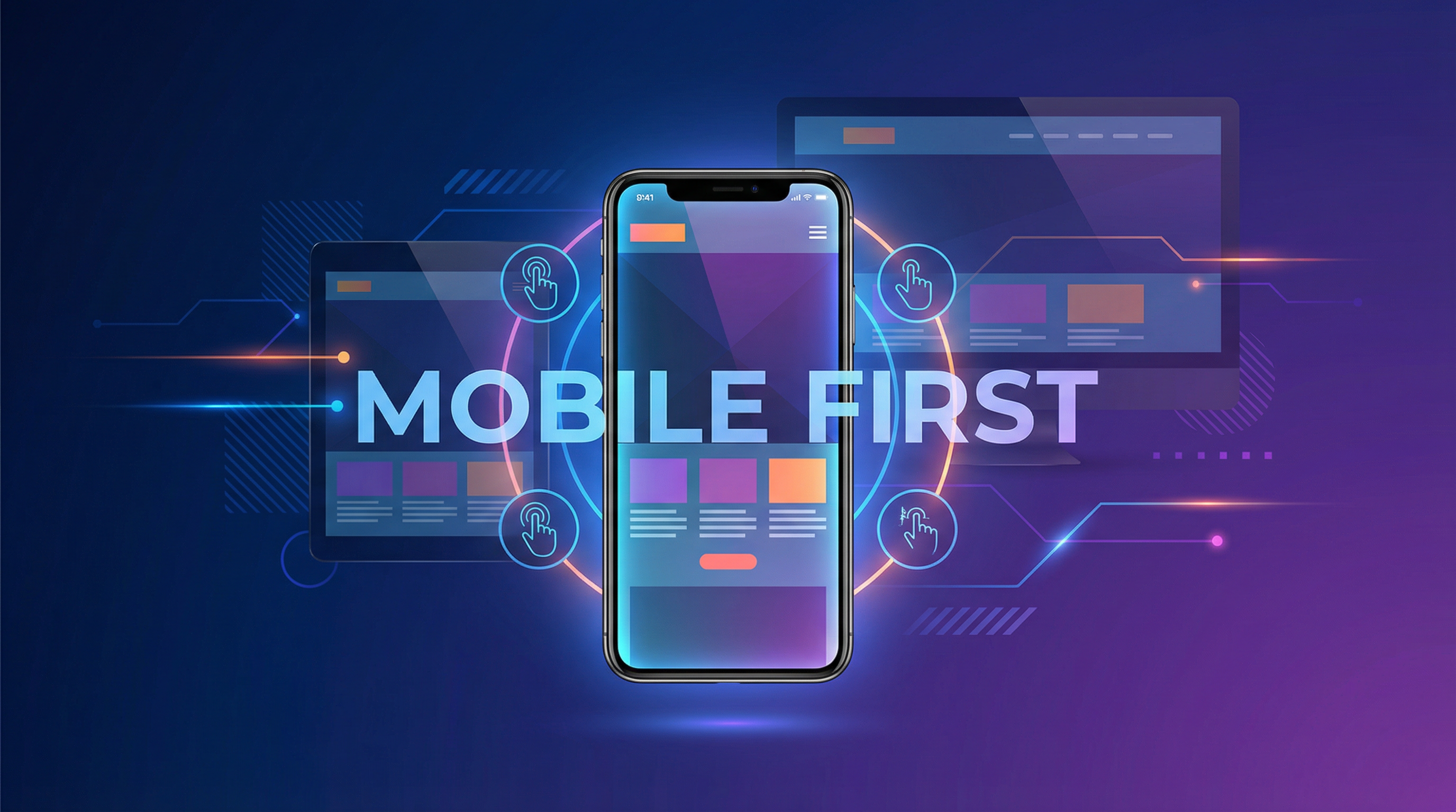
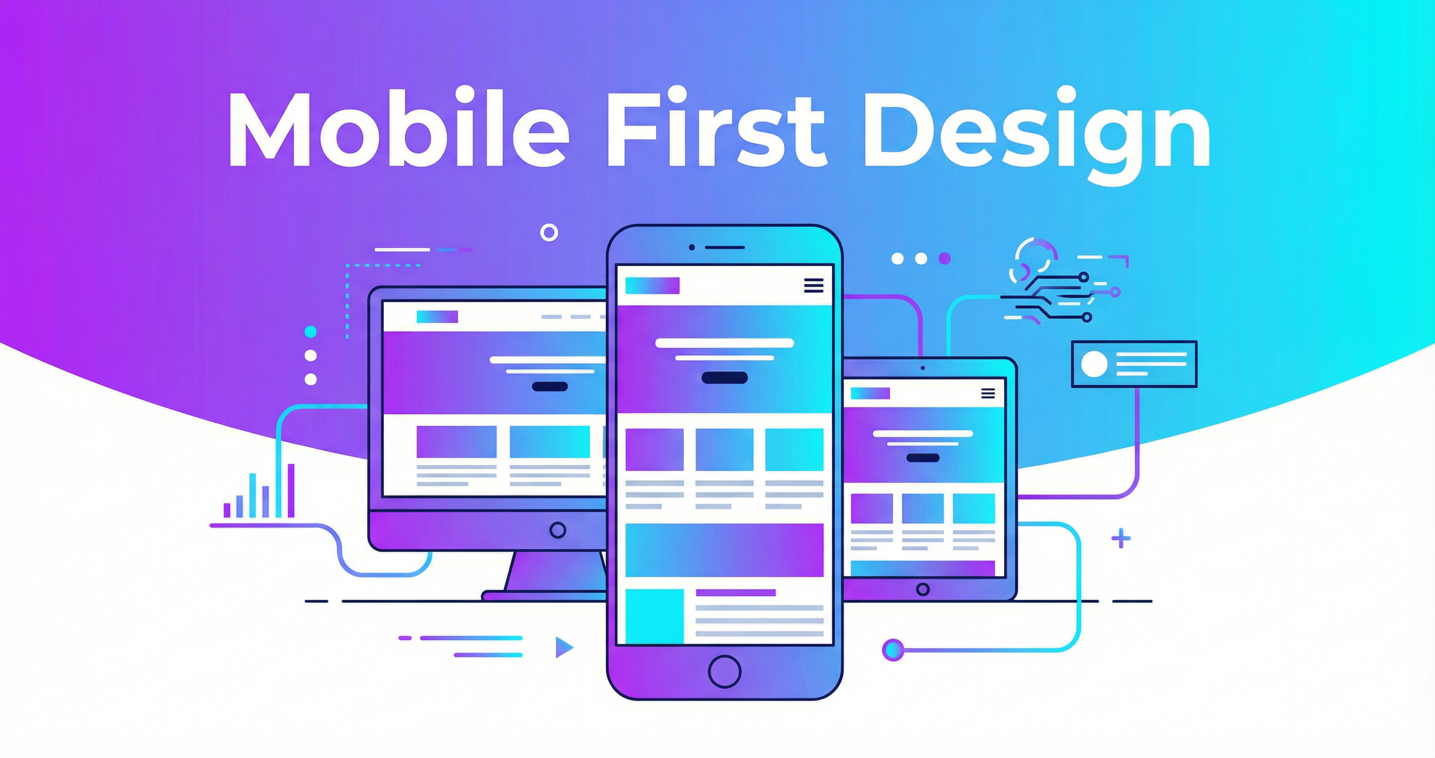
What Is Mobile-First Design?
Mobile-first design means designing and building the mobile version of your website FIRST, then scaling up for larger screens. It's the opposite of the traditional approach (design for desktop, then try to make it work on mobile).
This isn't just a design philosophy — Google has mandated it. Since 2019, Google uses mobile-first indexing, meaning they primarily look at the mobile version of your site when deciding how to rank you. If your mobile experience is poor, your Google rankings suffer.
Why Mobile Experience Matters So Much
Your Customers Are On Their Phones
Think about how YOU use the internet. How often are you browsing on your phone versus sitting at a desk? Your customers behave the same way:
- Searching for local businesses while out and about
- Comparing prices while shopping
- Reading reviews before making a decision
- Looking up your phone number to call you
- Checking your hours before driving to your location
All of these happen on a phone. If your site is frustrating to use on mobile, they'll go to your competitor who has a better mobile experience.
Speed Is Even More Critical on Mobile
Mobile users are often on cellular networks that are slower than home WiFi. They're also more impatient — the average mobile user expects a page to load in under 3 seconds. Mobile-first design ensures your site is lean and fast, even on slower connections.
Google Ranks Mobile-Friendly Sites Higher
Mobile-friendliness isn't just a nice-to-have — it's a ranking factor. Google openly says: "We generally show the mobile version of the content for indexing and ranking."
Signs Your Website Has a Mobile Problem
- Text is too small to read without zooming
- Buttons are too small or too close together to tap accurately
- Horizontal scrolling is required (this should never happen)
- Images overflow the screen or take forever to load
- Forms are painful to fill out with a keyboard taking up half the screen
- Pop-ups block the entire screen and the close button is impossible to tap
- Navigation is confusing or requires too many taps to find anything
- Phone numbers aren't clickable for one-tap calling
What Great Mobile Design Looks Like
- Large, readable text — At least 16px font size for body text
- Thumb-friendly buttons — At least 44x44 pixels, well-spaced
- Simplified navigation — Clean hamburger menu with clear categories
- Click-to-call buttons — Tap the phone number, it calls. Simple
- Optimized images — Compressed and responsive, loading at the right size for each device
- Short forms — Minimal fields, large inputs, appropriate keyboard types
- Fast loading — 3 seconds or less, even on 3G
- Sticky CTAs — "Call Now" or "Get Quote" button always visible
Real Business Impact
Let me put this in dollar terms. Say your website gets 1,000 visitors per month, and 30% of those are on mobile (it's probably more like 60%, but let's be conservative). That's 300 mobile visitors.
If your mobile experience is poor and you lose 50% of those visitors (conservative), that's 150 potential customers gone. If even 5% of them would have converted, that's 7-8 lost customers per month.
At an average customer value of $500, that's $3,500-$4,000 in lost revenue per month — all because your website doesn't work well on a phone.
How I Handle Mobile-First Design
Every website I build is designed and tested mobile-first:
- I design the mobile layout before the desktop layout
- I test on real devices — not just browser simulators
- I optimize images for mobile bandwidth
- I ensure every interactive element is thumb-friendly
- I use responsive images that serve the right size for each device
- I implement lazy loading so content loads as users scroll