We've crossed a tipping point in web browsing: mobile devices now account for over 65% of all web traffic worldwide. And for local businesses? That number is even higher — up to 80% in some industries.
This means the majority of people encountering your business online are doing so on a 6-inch screen while multitasking. If your mobile experience isn't excellent, you're losing the majority of your potential customers.
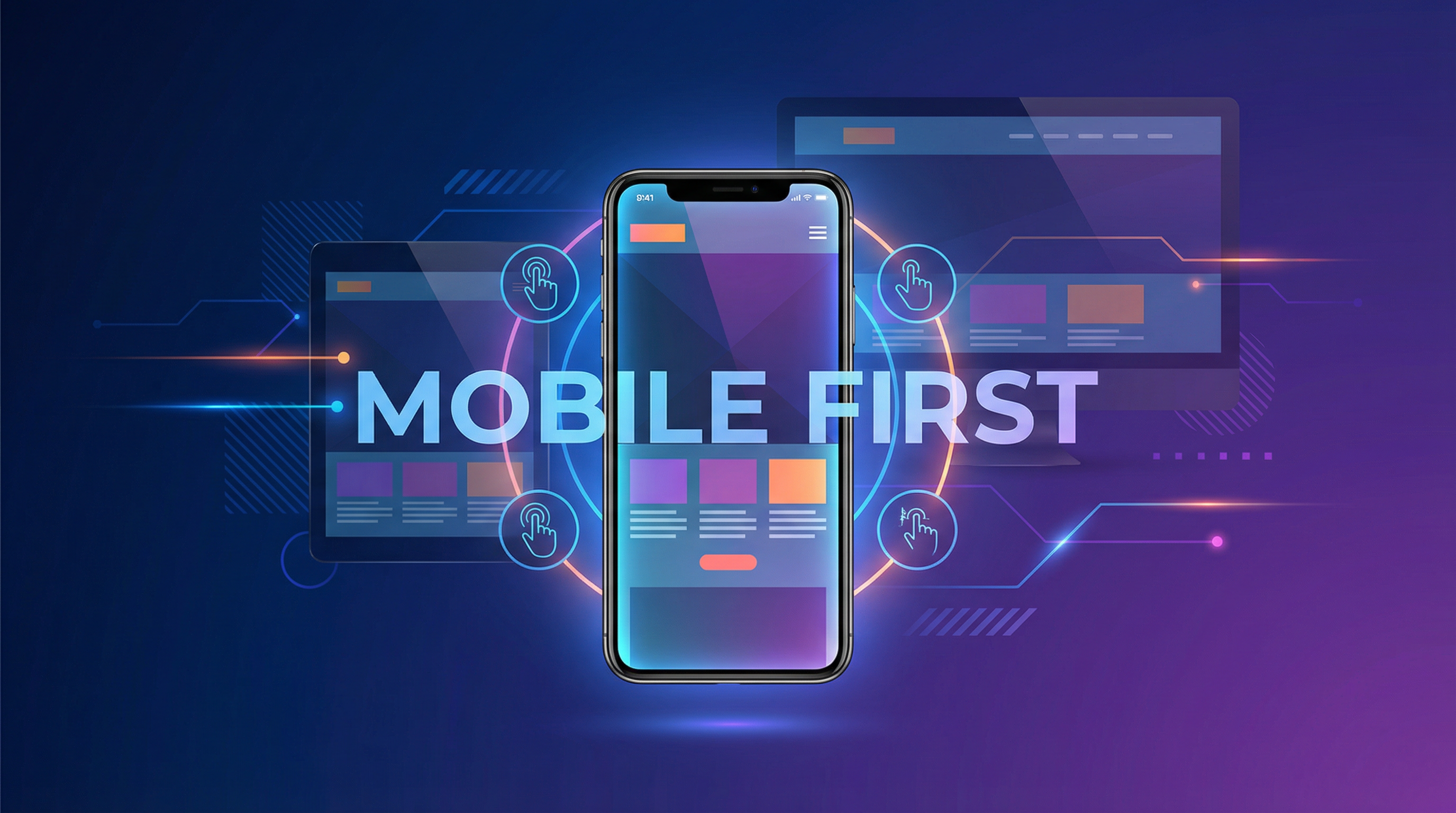
Mobile-First vs. Mobile-Responsive: What's the Difference?
Mobile-Responsive (The Old Way)
Design the desktop version first, then make it "shrink down" for mobile screens. The mobile version is an adaptation — often with compromises.
Mobile-First (The Right Way)
Design the mobile version first, then expand it for larger screens. The mobile experience is the primary focus — not an afterthought. This ensures the experience on the device most people use is the BEST version, not a shrunken compromise.
Why Mobile-First Matters for Your Business
Google Says So
Google switched to mobile-first indexing in 2019. This means Google primarily uses the mobile version of your content for indexing and ranking. If your mobile site is inferior to your desktop site, your Google rankings suffer across ALL devices.
Your Customers Expect It
57% of users say they won't recommend a business with a poorly designed mobile site. And 50% of users will visit a competitor's site if yours doesn't work well on mobile. Customer expectations for mobile experiences are higher than ever.
Conversions Happen on Mobile
Mobile isn't just for browsing anymore. People make purchase decisions, fill out contact forms, book appointments, and call businesses from their phones. If your mobile experience adds friction to any of these actions, you're losing conversions.
The 10 Commandments of Mobile-First Design
1. Speed Above All Else
Mobile users are often on cellular connections. Your site MUST load in under 3 seconds on mobile. This means:
- Compressed, properly-sized images
- Minimal, efficient code
- Lazy loading for below-fold content
- Minimal third-party scripts
2. Thumb-Friendly Navigation
People use their phones with one hand — primarily their thumb. Your most important buttons and links should be in the natural thumb-reach zone (center and bottom of the screen). Minimum tap target: 44x44 pixels with adequate spacing.
3. Readable Text Without Zooming
Body text should be at least 16px. Headlines should scale appropriately. Line height of 1.5 ensures comfortable reading. Nobody should ever need to pinch-zoom to read your content.
4. Simplified Navigation
A hamburger menu that opens to reveal clear, organized categories. No mega-menus or complex dropdowns on mobile. The path from any page to any other important page should be 2 taps maximum.
5. Click-to-Call Everything
Every phone number on your mobile site should be a clickable link. One tap = calling your business. Also consider a sticky "Call Now" button that's always visible as the user scrolls.
6. Streamlined Forms
Mobile forms should be absolute minimum fields. Use proper input types (tel for phone, email for email) so the correct keyboard appears. Enable autofill. Make field labels clear and persistent.
7. Vertical Scrolling Only
Horizontal scrolling on mobile is a cardinal sin. Every element should fit within the screen width. Tables should stack or scroll horizontally within their container.
8. Appropriate Image Sizes
Serve different image sizes for different devices. A 1920px-wide hero image on a 375px-wide phone is wasteful. Use responsive images (srcset) to serve the right size for each device.
9. No Intrusive Pop-Ups
Google penalizes mobile pages with intrusive interstitials (pop-ups that cover the content). If you use pop-ups, make them easy to close and ensure they don't cover the main content on mobile.
10. Test on Real Devices
Browser simulators don't catch everything. Test on actual iPhones and Android devices of various sizes. What looks fine in a Chrome DevTools simulator might not work correctly on a real iPhone SE or Samsung Galaxy.
Common Mobile Mistakes I See
- Desktop menu on mobile — Full navigation bars that don't collapse into a mobile menu
- Tiny tap targets — Links and buttons too small or too close together
- Unoptimized images — Full-resolution desktop images loading on mobile (5+ seconds)
- Fixed-width layouts — Content that extends beyond the screen edge
- Hover-dependent elements — Features that only work with a mouse hover (no hover on touch screens)
- Auto-playing videos — Wastes data and annoys users
- Unreadable text over images — Text that's visible on desktop but illegible on smaller screens
- Non-clickable phone numbers — Making users memorize and manually dial your number
Mobile Conversion Boosters
- Sticky CTA bar — A fixed bar at the bottom with "Call" and "Get Quote" buttons
- SMS/text option — Not everyone wants to call. Offer texting as an alternative
- Apple Pay/Google Pay — For e-commerce, mobile wallets dramatically reduce checkout friction
- Location-based content — Detect user location and show relevant local content
- Progressive Web App features — Add-to-homescreen, offline access, push notifications
How I Build Mobile-First
Every website I build starts with the mobile design. Not as an afterthought — as the foundation. The mobile experience is designed, coded, and tested first, then enhanced for larger screens.
- Performance-first architecture (sub-3-second loads)
- Thumb-optimized interaction design
- Testing on real iOS and Android devices
- Progressive enhancement for desktop
- Google's Mobile-Friendly Test certified